
Pottery Barn Colors Inspired Color Palette
It’s no secret that I love the looks of Pottery Barn! Their laidback style has, in fact, been a source of inspiration for me for over a decade, as the colors, and rustic materials used on both their furnishing and home decor resonate a lot with my Brazilian roots.
For some years now, they have showcased their interior colors collection, Pottery Barn colors, a selection of colors you’ll see in their catalogs in partnership with Sherwin Williams.

So, when I saw a dark navy blue popping up in their featured homes, it instantly sparked a desire to try a dark color in our new home. As you now know, it was a beautiful image in the BHG magazine that triggered the navy blue choice on our new home exterior colors!
Back in 2008, when we were living in Maryland, I bought this gorgeous blue and white rug for our family room. Well, little did I know that I’d fully embrace Pottery Barn’s beautiful, dark, rich blues in our new house.

Be Open To Change, And New Colors
The painting job on our last home in San Diego was arranged and contracted over the phone, from Maryland, before our move, and I went into “super safe mode” and painted the house beige from head to toe, but this time around, I was ready to try something completely different.
To balance all that beige, in San Diego, I played with colors on pillows, and home decor, and even hung super tall red floral curtains (talk about happiness!), but here I wanted to go the other way around and create contrast with the walls. Also, this house is larger, and I wanted to create more intimate spaces in the living and dining room areas where the dark color choice would be perfect for that.
On the other hand, I wanted to find a light color that would go on all other house areas as the base color. I wanted something that would make the house feel warmer and inviting, even in our family room with a double ceiling height.
I curated images of spaces with navy blues on my New Home Pinterest board to get me started. I also downloaded the Sherwin Williams color app (ColorSnap Visualizer at the app store) to see options for the colors I was flirting with by using the similar and coordinating colors functions available on the app.

Get Everyone Onboard
While Addie doesn’t get much involved in the decor of our house, it was essential to get him and the boys involved in the color selection process. Believe me! Even if they say “I don’t care,” once a color is up, they will let you know if they dislike it.
To help the boys “see” the colors, I pulled my clippings from catalogs and magazines, and that together with the patches of color on the wall, helped them make a decision; surprisingly, it also gave them ideas and inspiration on what they wanted to have in their bedrooms. Win-Win!
Test Your Colors Everywhere
Since we have an East-West house and the light pours in all day long through the windows, making the colors look very different depending on the time of the day, I wanted to test all these colors “everywhere” in the house to make sure we loved them. So, we lived with the old paint and several patches of colors for quite some time on our walls before we made our final choices.
We started with a selection of grays, “graiges,” and dark slate, which I honestly thought I wanted, but we found them cold, formal, and not like us at all. We also tested several “whites,” Soon, I learned that a real, old-fashioned white is the hardest thing to find these days! LOL
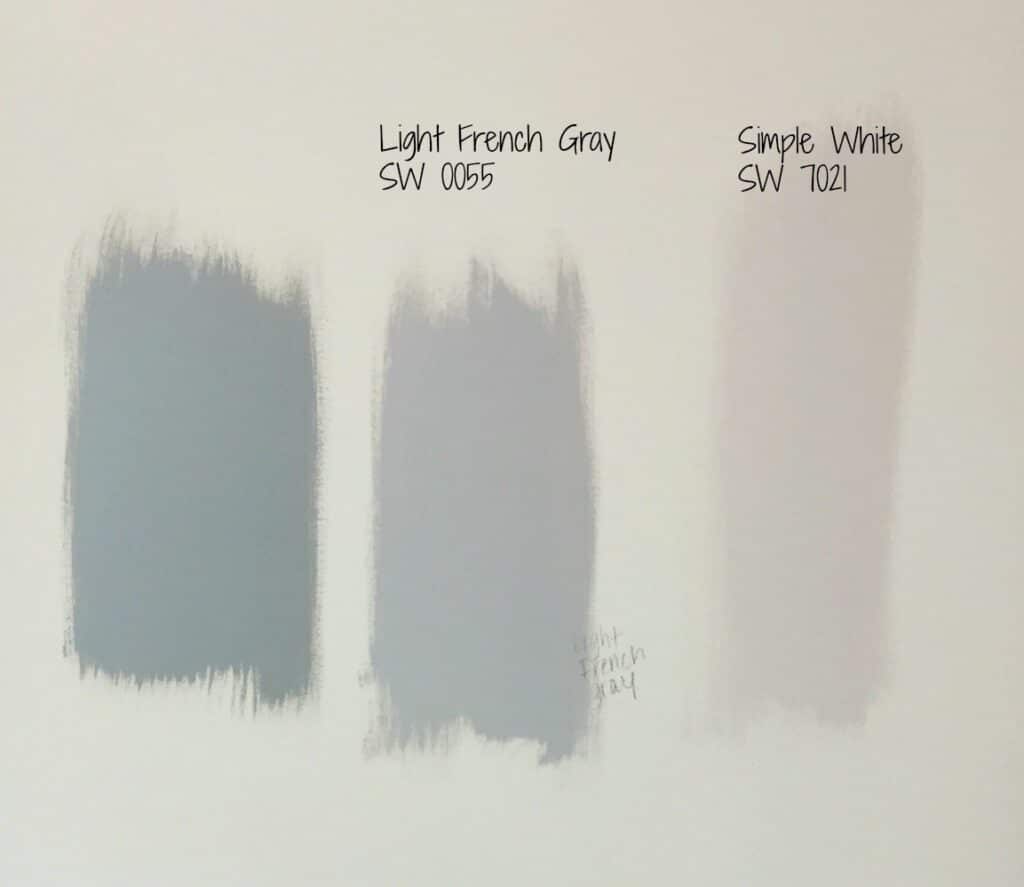
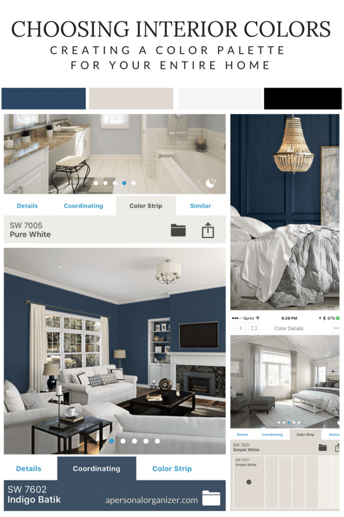
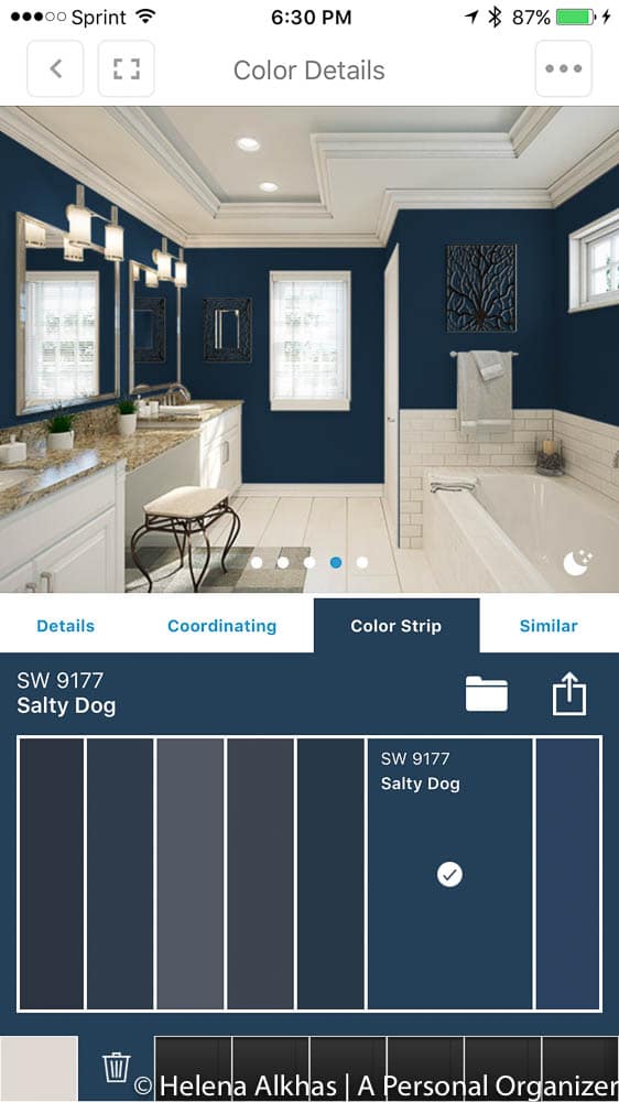
For the dark color, with the grays and slate out of the way, we decided to try a navy blue color similar to what we used on the exterior. There are several options on the market, and we tested Indigo Batik (SW 7602), Commodore (SW 6524), and Salty Dog (SW 9177).
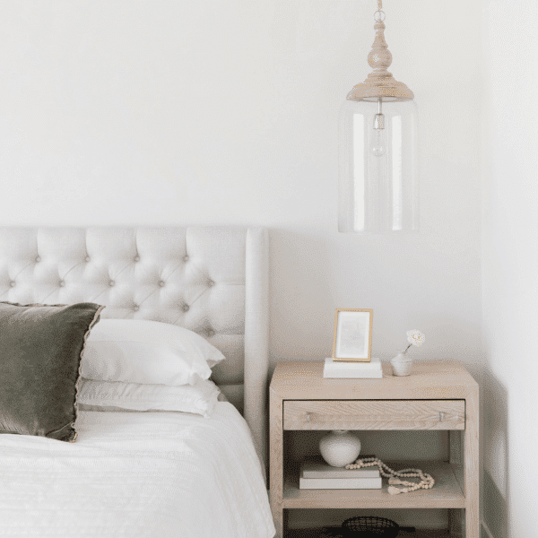
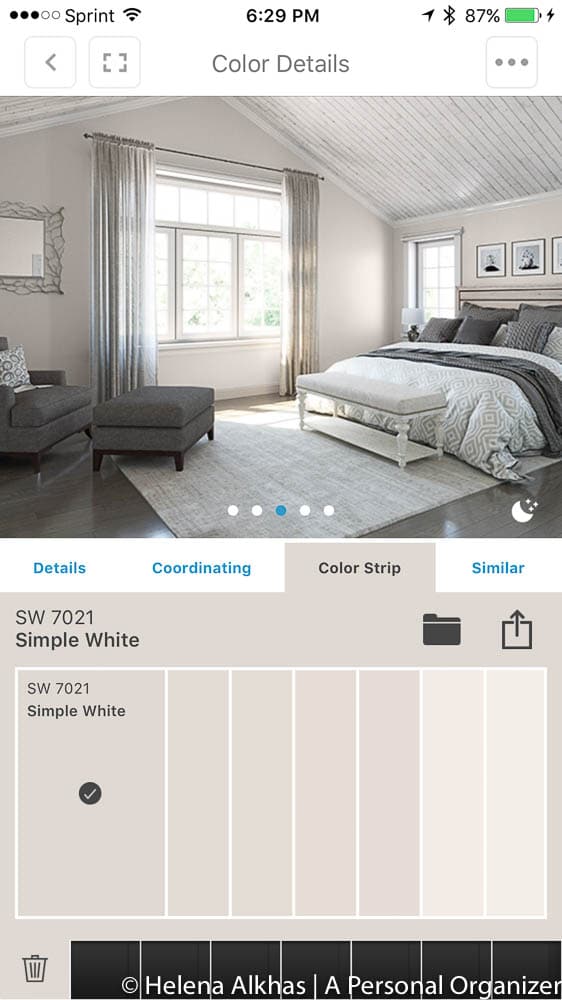
We finally decided to test a color called Simple White (SW 7021) from Pottery Barn Colors. It was a match made in heaven for our house, and it balanced so well with the dark navy blue we were planning on using inside. Above, you can see Light French Gray and Simple White.
We tested Simple White on several house areas to see how it would look, and I can’t tell you how much we loved it. Depending on the time of the day or the weather outside, this color will have tonnes of very delicate, sophisticated pink. Other times it will look like an ultralight gray, while on other days, I will swear it’s just beige, making it the perfect color for me: never a dull moment!
Once we felt the colors were right for us, we went ahead with the painting process, which happened with us already living in the house.
Ultimately, our Pottery Barn-inspired color palette became:
- Simple White (SW 7021) for all walls, in all rooms except the living room and bathrooms.
- Indigo Batik (SW 7602) for accent walls and details.
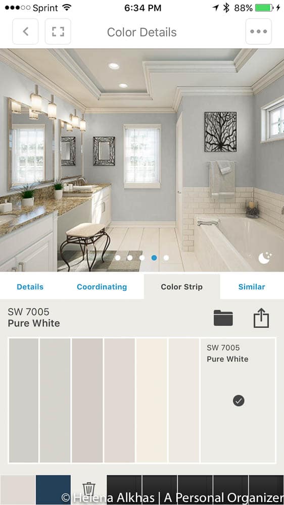
- Pure White (SW 7005) for all trims, doors, baseboards, and molding.
- Black Magic (SW 6991) for the front door and shutters

The Interior color palette we ultimately used
I hope our color journey helps you when selecting interior colors for your home. The best thing about paint is that if you don’t like it, it’s the easiest fix ever!
Next, I’ll share with you our living room which became my favorite spot in the house to enjoy my first cup of coffee.
Leave your comments and questions below. I’d love to hear from you.